How to Leverage Your Headline and Cover Photo on Little Red Book
Last week, we briefly covered the essential elements of creating high-performing content on the popular Chinese social media platform Little Red Book. In this blog post, we get hands on and show you how to apply our tips to create content for RED! In the upcoming Little Red Book series, we will be getting into specifics of full-stack high-performing content on RED. Let’s get started with your post cover photo and headline!
The headline and cover photo matter! Book covers with compelling visuals can instantly connect with and impress your audience before they dig into the book. The same theory applies to RED. You need to fully leverage the headline and cover photo and connect with viewers emotionally so that they will click and watch your high-value content.
A high performing cover photo should do 4 things:
Emphasize the key point of your content
Clearly depict your value proposition
See from the viewer’s perspective
Integrate daily elements that resonate with viewers
But how do we do this? Let’s learn from the best and take a look at some successful examples on Little Red Book!
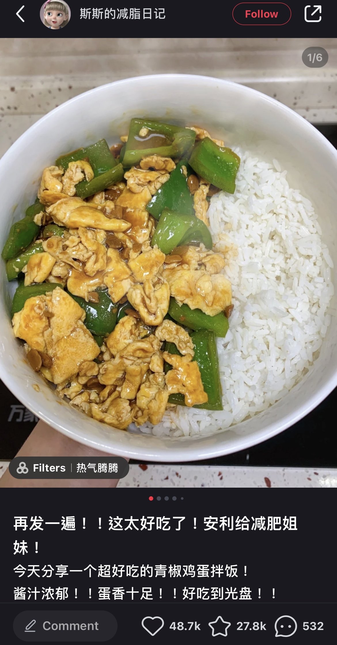
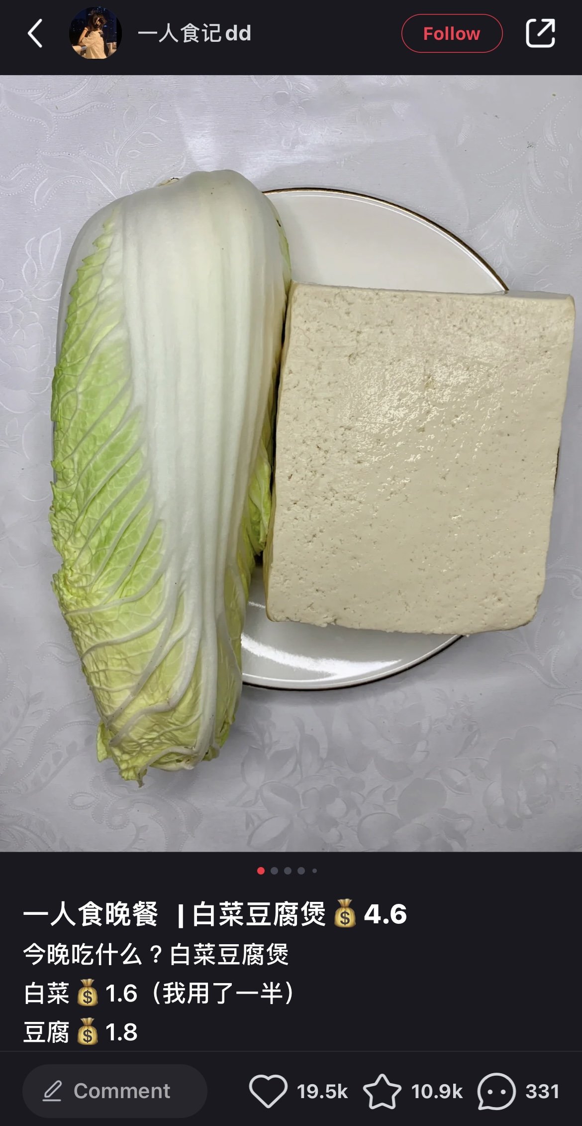
If you’ve got kids, you would know that children nowadays could master content creation - so their photos would likely look better than the above examples.. But, can you believe that simple content like this went viral on Little Red Book? As we already mentioned in our previous blog post, staged and overly edited images with glamorous backgrounds might perform well on Instagram or Pinterest but not on Little Red Book. It’s not because viewers on RED do not crave pleasing aesthetics, but most of them seek authenticity, integrity and practicality.
The cover photos were taken from a bird’s eye view with minimal or possibly no edits. The kitchen countertop and table cloth are in the background without any distractions, which make them very genuine, practical and relatable to viewers.
Moreover, the headlines are simple and straight to the point -- “This is too delicious! Repost for girls who are on a diet” on the left and “Having dinner alone | Cabbage Tofu Pot $4.6” on the right. Do you see any similarities?
They both have apparent value propositions guaranteeing viewers what they can take away from the content. Also, the items displayed in the cover photos are straightforward. They indicate that the recipes of both dishes are frugal, easy, practical and enable viewers to achieve their fitness goals with a nutritious meal at an affordable cost.
When cover photos align with the headlines, the value propositions miraculously amplify, and viewers just can’t help clicking it as everyone fears missing out on good content. Yet, we cannot apply the same formula in every case.
Let’s take a look at another excellent example that says otherwise!
The cover photo gives off an elegant and chic vibe overall. At first glance, viewers might relate it to another designer-branded OOTD (Outfit of the day) post on RED. However, the headline here says, “I make $700USD monthly, but my colleagues tease me for dressing like a super-rich woman,” the contradiction between the photo and the caption successfully intrigues curious viewers, who engage with the post. This post had over 25.6K likes and 9912 saves!
The trick here is to create a discrepancy between a contradicting title and cover photo, piquing the viewer’s curiosity to click the cover photo and hence, engage with the content.
Viewers are drawn to entertaining and results-oriented content
We have been sharing our insider tips to grow your social media because we genuinely want the best for your business. You expect us to think from your perspective, and likewise, this is what your target audience expects when they are reading on your social media channels.
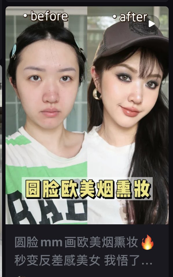
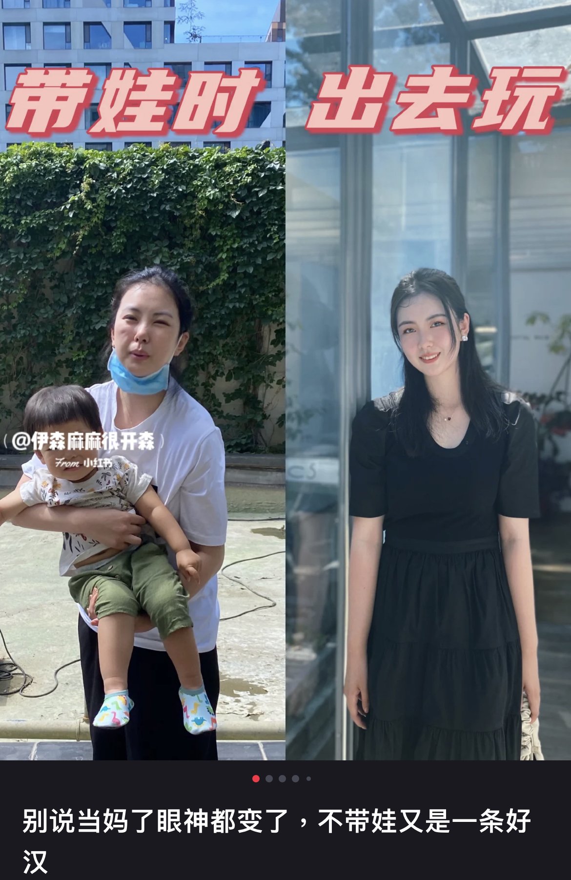
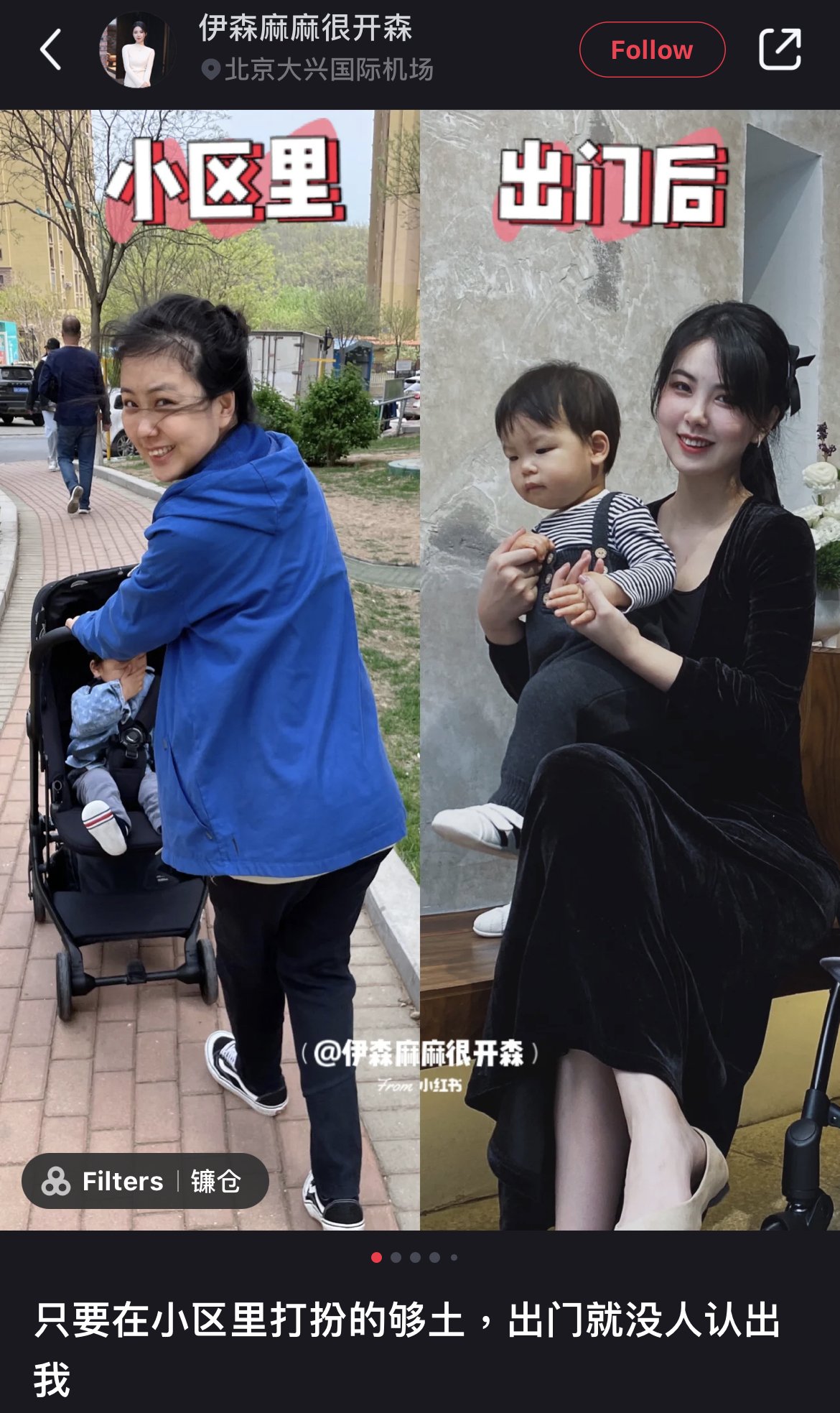
Most of the time, viewers on RED look for inspirations in fashion, makeup, personal growth or even life advice. Creating a solid contrast with the “before and after” photos to stir viewers’ emotions is always the most common and impactful way to resonate with your audience.
However, if you are thinking of creating a stark contrast with an artificial touch by using beauty apps? Think twice. Viewers on RED are very sensitive to overly-edited and sponsored content. You can only fool your viewers once. Credibility is everything on RED!
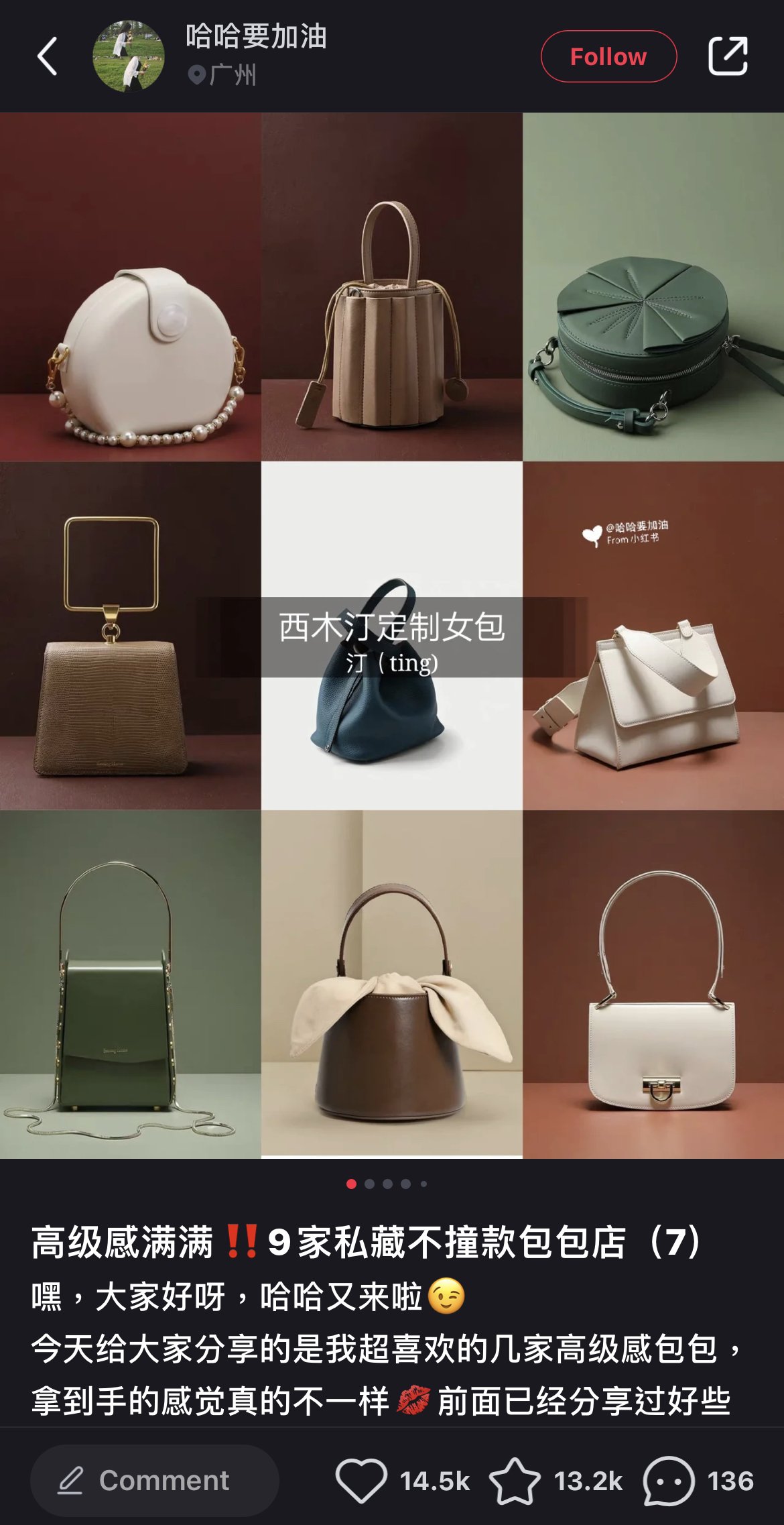
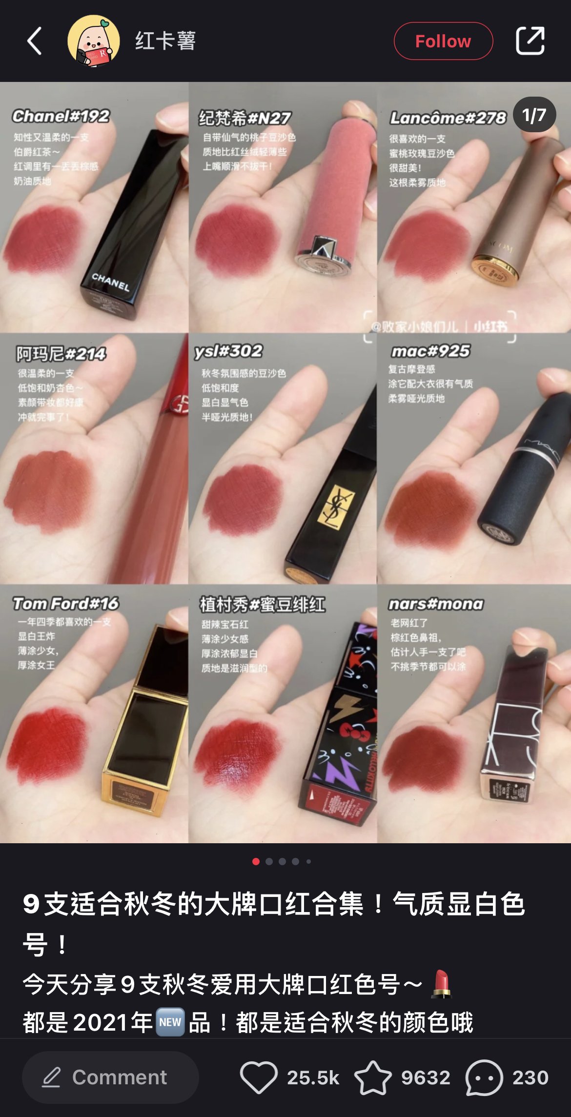
Nevertheless, there are plenty of creative angles you can incorporate. You can compile a couple of outfit shots featuring different outfits with fashion items like jackets or focus on details like the leather, zippers, inner lining and more presented in a nine-square grid like this. This photo form shows everything you will mention in the content so that your viewers know what information to expect from just a glance of the cover photo.
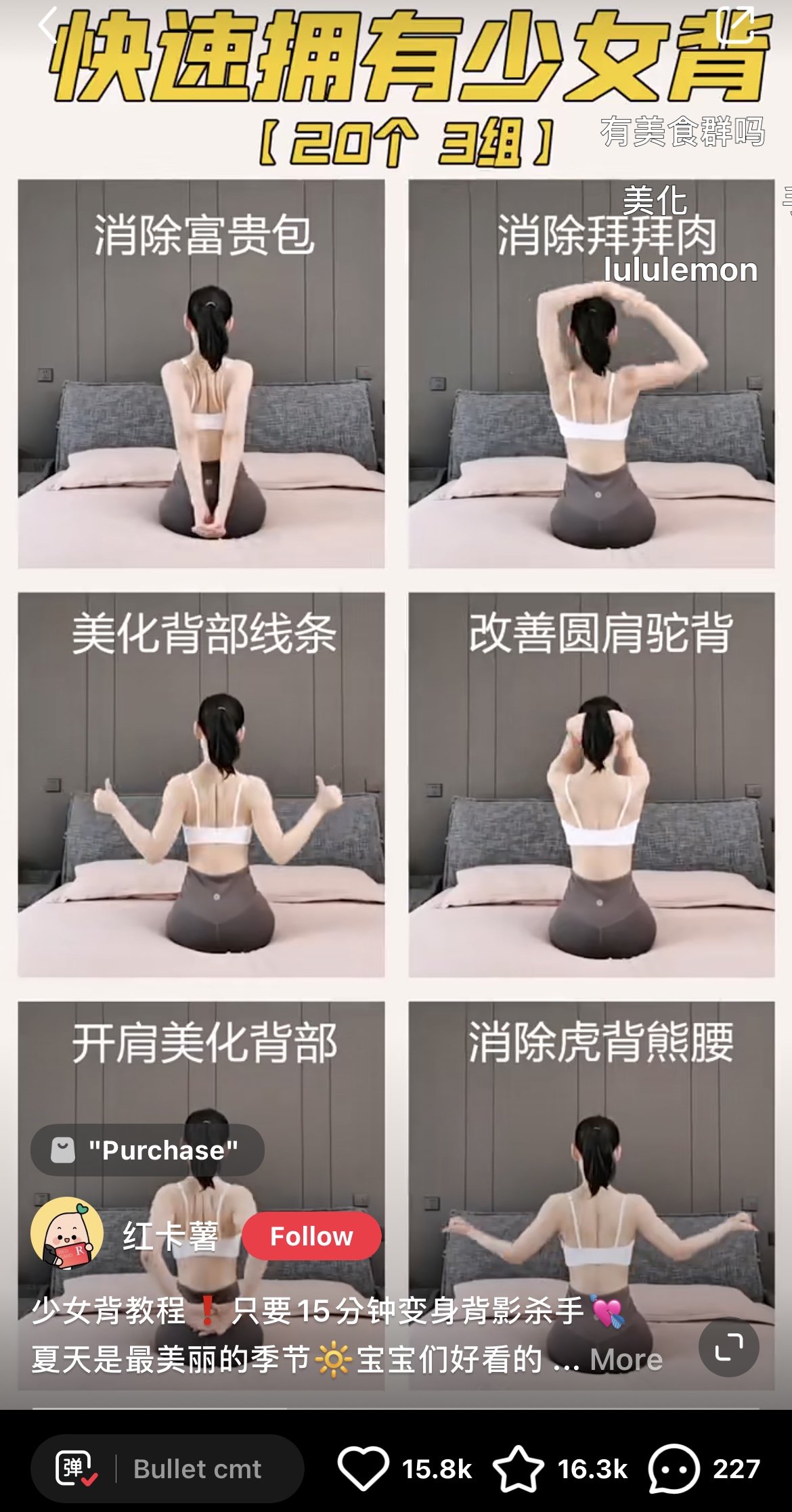
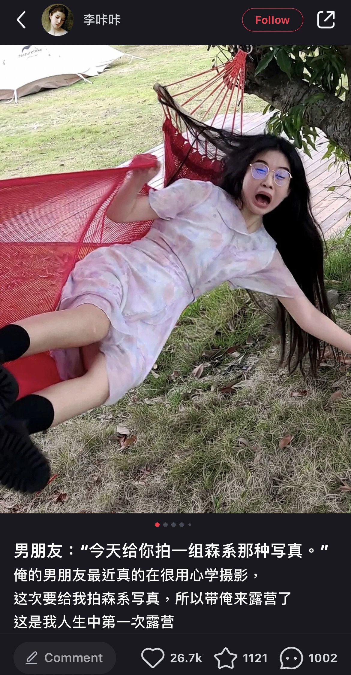
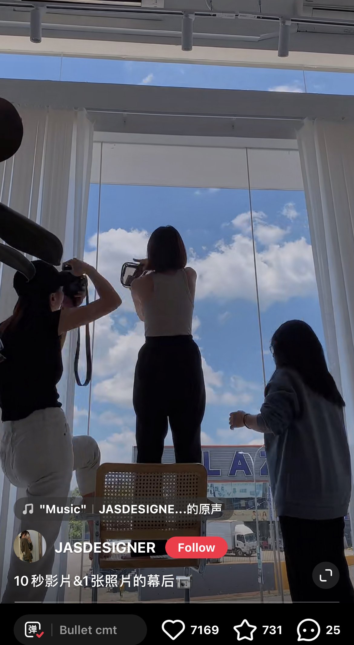
Or you could even show some embarrassing Behind The Scenes photos that your viewers never expect to see like this one. After all, we just love to be entertained, don’t you agree?
And everyone is just perfectly imperfect, right?
Now, which creative direction would you adapt to get the most attention from viewers on RED for a deeper connection? If you were a viewer, which one piques your interest the most?
When your content is valuable and practical enough, viewers will engage by dropping a like, leaving a comment or saving the content. Although we have shown you some high-performing examples on RED, we still got many more best practices and tips up our sleeves!
This is just the tip of the iceberg when it comes to how you can grow your Little Red Book account. Next time, we will be sharing the content planning strategy on Little Red Book and what it takes to create viral content on the platform. Follow us on our social media channels to get all the latest updates. Stay tuned for our deep dive Little Red Book content creation tutorials!
If you want to develop a competitive edge in your business, Little Red Book is a platform you have to get on! Reach us at info@catalystagents.com for consultation advice. We look forward to hearing from you.


