
Peach Fuzz: An Analysis of the Pantone Colour of the Year in Design and Consumer Behaviour

In the ever-evolving world of colour psychology, PANTONE 13-1023 Peach Fuzz has emerged as the unlikely hero of 2024. This soft, velvety hue, a delicate dance between pink and orange, is more than just a trendy shade – it's a canvas for emotional response and user behaviour. Let's delve beyond the surface of Peach Fuzz and explore its fascinating psychological impact on design.
Nurturing the Mind, Body, and Soul:
Peach Fuzz isn't your typical pastel. It possesses a warmth and depth absent in its pink and orange counterparts. This richness evokes a sense of care and comfort, akin to a plush rug underfoot or a cashmere sweater on a chilly day. In design, this translates to safe and inviting spaces, encouraging connection and fostering a sense of belonging.


Photo Credits: Hommes Studio
If you aim to illuminate a dim living space, create a cozy atmosphere in your dining area, or inject a burst of colour into a contemporary loft, Peach Fuzz is undoubtedly a suitable choice.
Evoking Empathy and Trust:
The subtle pink undertones of Peach Fuzz trigger a subconscious association with skin, creating an inherently human connection. This fosters empathy and builds trust, making it ideal for branding and marketing.
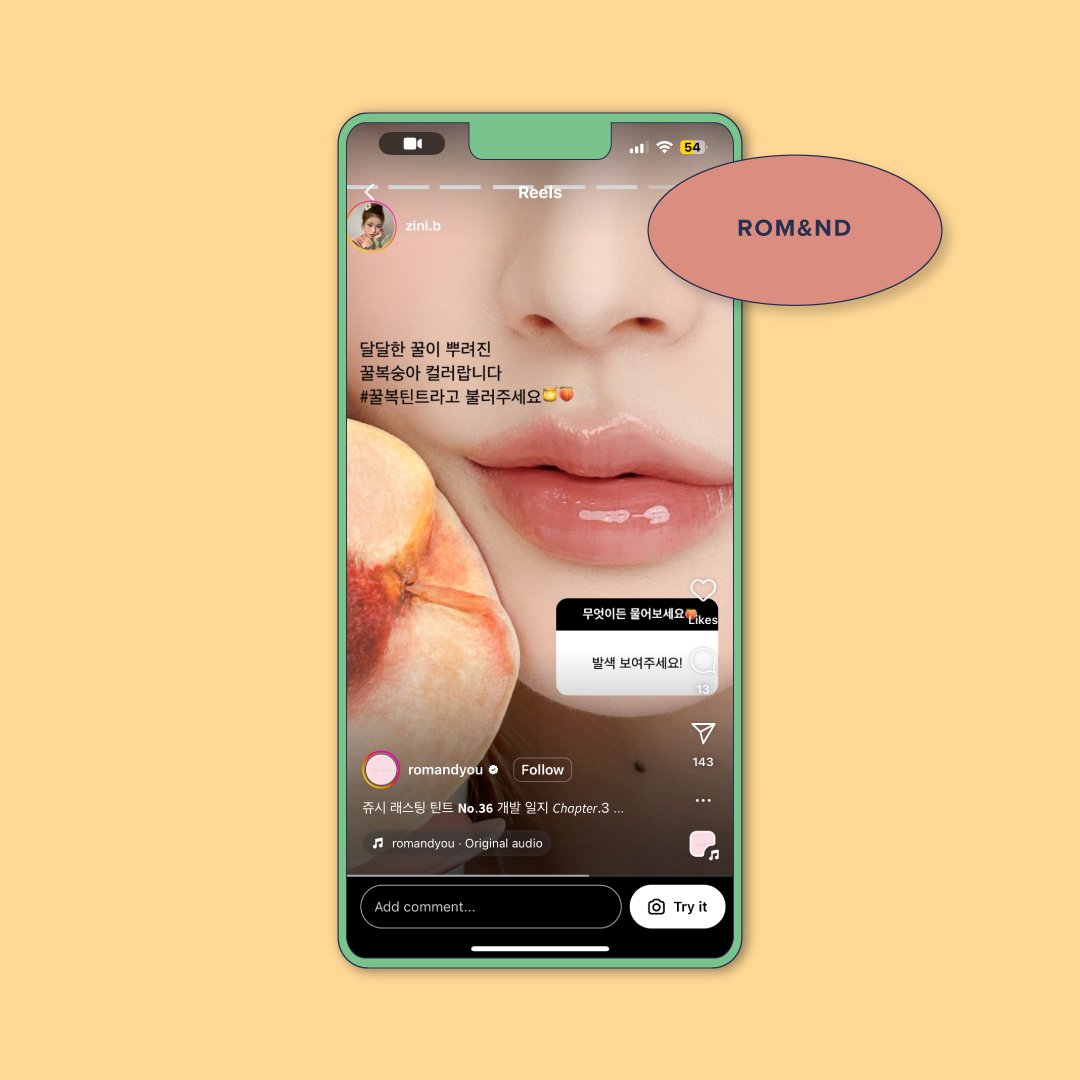
We can take a look at this popular Korean makeup brand: Rom&nd. One of their more popular and best-selling shades closely resembles that of the Peach Fuzz Pantone colour.
Imagine encountering a logo or website bathed in Peach Fuzz – it feels less corporate and more like interacting with a friend or trusted advisor. This emotional resonance can lead to increased engagement and brand loyalty.
Mindful Microdosing of Color:
Unlike its bolder cousins, Peach Fuzz doesn't demand attention. It's a colour you notice on a subliminal level, adding a touch of serenity without overwhelming the senses. This makes it perfect for design elements that require nuance and subtlety, like call-to-actions or product packaging. A website call-to-action in Peach Fuzz might feel less like a pushy button and more like a gentle nudge in the right direction.

Many big brands like Acne Studios have incorporated this colour in their products or overall visuals online. It is more approachable and gives consumers a vision of calmness and wellness.
A Color for Our Times:
The rise of Peach Fuzz reflects a cultural shift towards wellness and emotional well-being. In a world increasingly dominated by technology and uncertainty, we crave spaces and experiences that soothe the soul and foster connection. Peach Fuzz, with its subtle warmth and inherent humanity, taps into this desire, offering a visual respite from the digital cacophony.
Beyond the Trend:
While Peach Fuzz may be the reigning colour of 2024, its psychological impact transcends mere trendiness. By understanding how this hue influences our emotions and behaviours, designers and marketers can wield it strategically to create effective campaigns and user-centric experiences. So, the next time you encounter Peach Fuzz, remember: it's not just a colour; it's a conversation starter, a mood changer, and a gateway to deeper connections.