
[Case Study] Branding Design For The Canadian Mental Health Association

As the largest, most established community mental health organization in Canada, The Canadian Mental Health Association CMHA is known to provide advocacy, programs, and resources that help to prevent mental health problems and illnesses in more than 330 communities across Canada since 1918.
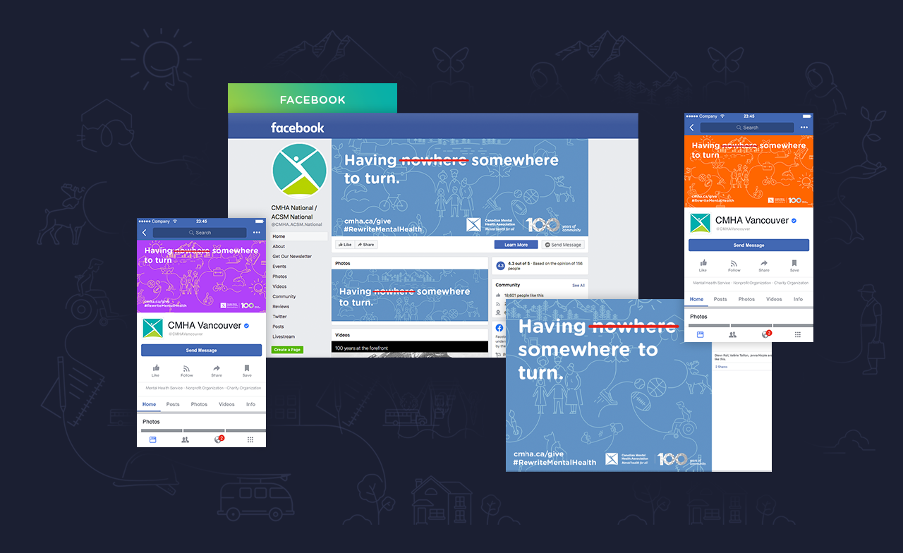
As a creative agency that advocates for mental health awareness, we are honoured to have had the opportunity to work with the CMHA on a recent project to design a full suite of graphics for their National team to drive mental health awareness in Canada. The suite of graphics will be used across online and offline CMHA channels, including, but not limited to their social media cover photos (Facebook, LinkedIn, and Twitter), Instagram posts template suite, email signature, CMHA National newsletter banner, official website template, and select offline materials.
In the creative brief, we were given specific terms and ideas that needed to be presented visually to communicate the brand's message and efforts in driving mental health awareness. The graphics and its corresponding messaging should also appeal and resonate with the general public, as the organization wants to engage the greater community in a discussion that mental health is something shared by all people, whether or not you have a diagnosis. The CMHA also wanted to use this opportunity to emphasize their ongoing efforts across Canada through nationwide planning to build partnerships with communities, as well as their values in inclusivity and diversity. Through an organization-wide brand survey at the CMHA, we were provided with a list of keywords chosen by their team that best represent their current brand personality. As for colours, we were asked to incorporate their original brand colours, and given the creative space to introduce new colours that highlight the positive and approachable aspects of the brand to align with their messaging.
The Design Process
To conceptualize the design, terms that embody the brand values such as connection, community, inclusivity, truth, and reconciliation were visually categorized into four different groups: work, live, learn, and play. Visuals in the form of playful doodles were then created and set against a series of cheerful colours as well as the CMHA’s original brand colour. Finally, a succinct and empathetic message is overlaid on the powerful graphic to grasp the audience’s attention. We intentionally selected an approachable font to facilitate a friendly introduction to the brand, as well as tying in the CMHA’s value of inclusivity.

The final slogan, "We are all connected", summarizes the campaign and speaks to the bond we have with each other, nature, the urban environment surrounding is and, most importantly, with ourselves.
We want to take this opportunity to thank the CMHA for giving us a chance to contribute to a cause we hold close to our heart! Interested in seeing the graphics in action? Visit their website here!
"It was an absolute pleasure working with Catalyst Agents! George and the team created an incredible suite of graphics for us that we're thrilled with. They spent the time to ensure they understood our brand, mission, vision, and goals, and were highly communicative throughout the whole project. Our end result is something we absolutely love, and something we'll be getting a lot of use out of. We highly recommend working with this amazing team!” -CMHA National